
Table of Contents
Before You Draw Anything
A client recently showed me a $20 deck plan she bought on Etsy. 240 sq. ft., no beams, 26 footings. She had a new pool in farm country outside Elmvale, Ontario, Canada, open to the northwest and the prevailing wind. She had done her homework—just not with the right people.
She didn’t understand my questions about footing type, so she called her son-in-law out. He showed up—no-nonsense, stern, trained carpenter, finishing his own addition.
I walked the site and kept my mouth mostly shut. The pool and deck placement made sense. But that northwest exposure was going to make the space miserable for most of the season without some wind protection. I mentioned the wind, and that a floating deck adjacent to a pool can lift with frost at a different rate than the pool structure, which can damage the pool. If you wanted to do a floating deck, fine, but getting permits may be grief and may require an engineer’s stamp in our area. You would have to keep the deck surface 3” below the bottom of the coping. Permanent footings were an option.
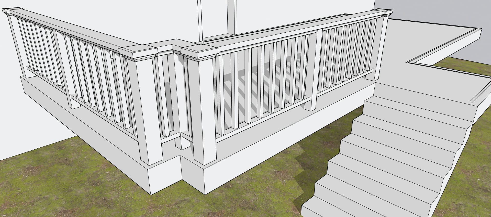
She told me I was the first one to mention it. I was writing this article at the time and broke my own rule: I did this consultation for free.
I suggested a privacy screen on the northwest side. She wanted something operable. Over budget. I suggested glass panels. Her daughter pushed back. She didn’t want to block the view—a flat, dusty farmland.
They were adamant about keeping it open. I told them functionally you really should have something there. Even solid panels.
“Here’s where a great deck builder upstages architects. Architects don’t always consider the cost.”
Discovering the Budget
People will tell you their medical history before they tell you their budget.
Never assume the budget from the house or the neighborhood. I once designed a 3,800-sq. ft. deck for one of the Dragons from Dragons’ Den. When I asked for a budget range, he said, “It doesn’t matter.” The two Lamborghinis and the other supercars in the garage suggested he was telling the truth. The house was 30,000-sq. ft. so I took him at his word. When I presented the design including the kids’ play structure, the pop-up TV, the big ipé deck with tear-drop shaped planters, he went white when the $385,000 price tag came up.
He stiffed me on the design fees. That’s when I started charging upfront for consultations and designs.
Putting Lines on Paper
Here is where you add up what the site told you, what the client told you, and what the house told you, and you put it into a layout. Two, maybe three concepts. Never more.
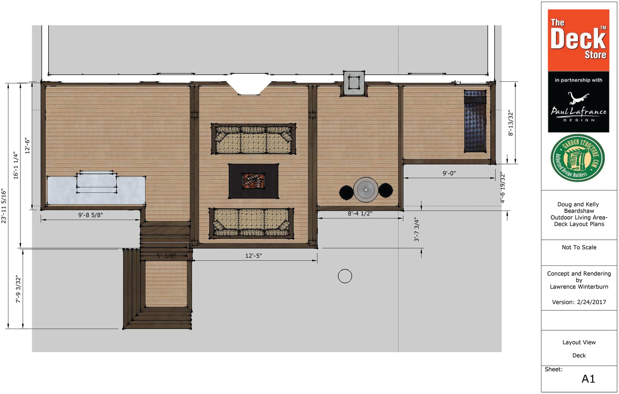
For lower-budget projects, this matters just as much. A client with $30,000 to spend still deserves a design process. Two clean layouts at two price points give that client ownership over the direction. It is also how you close the job. Have your contract filled out. The client is not deciding whether to proceed. They are deciding which version they want. That is a different conversation.
People have a hard time judging space from a blank floor plan. Sketch the furniture in at scale. The chairs, the table, the loungers, to scale if you can. They will see the path from the door to the dining table. That is the difference between a layout and a design.
Project One: Raj, MI.
The client in Michigan had a local builder with a proposal already on the table. A bigger version of what was already there: a low rectangular platform that followed the angular footprint of the house, a table and six chairs, nothing to distinguish one area from another. The house was well built and well kept. The deck was an afterthought.
I was asked to offer an alternative. Concept one addressed the same footprint as the builder’s proposal, but with defined zones. Concept two introduced a pergola over the seating zone, shifted the dining, and gave the grill a defined area. The overhead structure created shade, provided zone definition, and gave the house something to read against the yard. The footprint was slightly larger. The budget was higher. The client stretched to get there.
Project Two: Doug and Kelly, Ottawa
Some clients hand you a wish list. Doug handed me a sketch. He had built his own decks and renovated his own homes. He and his wife had a clear expectation and knew what they wanted. The sketch included a hanging bed, a sofa, chairs, a bar, a BBQ. But the space was too tight for what they wanted, and the psychological budget ceiling was going to be a challenge.
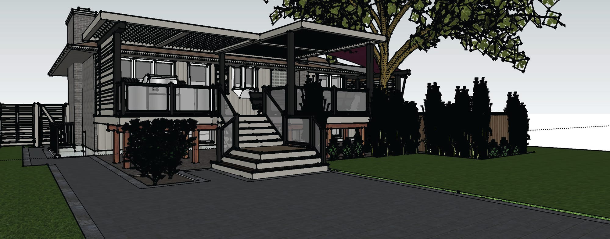
The lot backs onto greenspace. A large tree roughly 10 ft. from the house, which meant it had to be worked around and worked with simultaneously. Five design versions moved through the process of increasing the overall size, positioning a lap pool, and maintaining the tree as part of the composition. The psychological number was around $100,000. Each version pushed gently past it as the clients got comfortable with what they were getting.
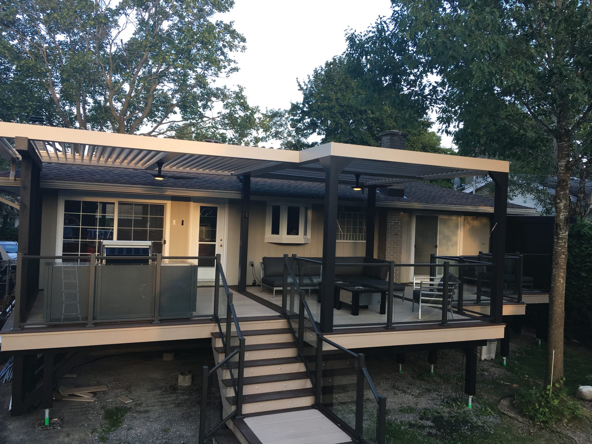
The final design has a louvered pergola structure running the full width of the rear elevation, a cedar screen feature wall with an outdoor television, an outdoor kitchen zone, glass railing throughout, and a horizontal privacy fence running the full yard perimeter. It reads as a complete outdoor room with a minimalist linear flavor. The lap pool was deferred and installed later.
The clients trusted the renderings enough to source the furniture and a big fan that appeared in the drawings.
Making Budgets Work
Here’s where a great deck builder upstages architects. Architects don’t always consider the cost.
Curves cost money. The durable way to build a curved rim is laminations—multiple thin strips built up to the profile, glued and fastened in a form. That labor adds up fast. Unless a client has a generous budget, steer toward straight lines.
Level changes are the other item to price carefully. Every platform drop means more footings, more framing, more time. Account for confined site access or second-story ladder work and the cost climbs further. That is where margin goes if it is not priced correctly.
Larger platforms are more efficient to build than smaller ones. A 200-sq. ft. deck can carry the same stair run and nearly the same linear footage of rail as a 400-sq. ft. deck. Small decks concentrate the expensive work and spread it over less square footage.
Staircases are the most underpriced item. A well-built stair takes more labor than a small platform. Price it accordingly.
Work backward from the margin you need. Set a daily crew rate that maintains it, then make sure every element is priced properly.
Simple Does Not Mean Boring
Most profitable decks are rectangles. The question is what you do with the details.
Corners are an opportunity to work in unique detailing.
Here is an exercise I use when a design feels flat. Take three playing cards and throw them on a table. Move them around. Overlap them, offset them, shift one at an angle. Obviously 22.5° or 45° is easier to frame. Do it a few times. Those arrangements are your platform options. Separate platforms connected at short perpendicular runs—even a 4’ jog—break a simple shape into something that looks more interesting. The illustration below was created by overlaying three rectangles measuring 12’ x 16’, overlapping and connecting to create three defined spaces. The square footage is the same, there is a bit more rail and a couple of extra footings so it is a slight premium, but most clients will stretch the budget to get there.
If there is a view worth capturing, orient the deck toward it. Frame that view with the leading edge of the platform. Connect the adjacent platform with a short perpendicular run. The geometry does the work.
The Design Principles
Architecture and landscape architecture programs teach seven principles of spatial composition: unity, balance, scale, proportion, focal point, rhythm, and sequence. Not style preferences. The framework every trained designer uses before making any formal decisions. Here is what they mean on a real deck project.
Scale and Proportion
Scale is the relationship between a structure’s dimensions and the human body. Proportion is the relationship between the deck’s parts and the whole.
Most decks are undersized for what they’re supposed to do. A dining table for six needs a minimum 12’x12’ zone so chairs can push back without hitting the railing or each other. A conversation grouping for four needs roughly 12x12. A cooking zone with a grill, counter, and refrigerator needs at least 8x10. These numbers come from ergonomics. They’re fixed by the human body, and they don’t move with the budget.
Unity
Unity is what makes a deck look like it belongs to the house rather than being bolted onto it.
Walk to the street and look at the building before you design anything. What would look like it grew there naturally? A house with strong horizontal lines and a clean contemporary profile doesn’t belong with Victorian-detailed railings. A traditional colonial doesn’t belong with cable railing and minimalist horizontal decking. The deck should speak the same language as the house.
Balance
Balance is the visual distribution of mass across the composition.
Formal balance is mirror-image symmetry on either side of a central axis. It suits traditional houses and formal settings. Asymmetrical balance uses different elements of equal visual weight to create equilibrium without mirroring.
Practical application: a large built-in kitchen on one side of the deck with nothing of comparable visual weight on the other side will look unresolved. The counterbalance can be a pergola, a level change, a seating wall, or a planting feature. It doesn’t have to be the same kind of element.
Focal Point
Every successful space has a focal point. One element draws the eye first and gives the space an organizing center. Without it, the eye wanders, and the observer feels vaguely uneasy without being able to say why.
The focal point usually comes out of the site read. A long view, a fireplace, a water feature, whatever it is, orient the primary seating toward it and build the rest of the composition around it.
Fire is one of the most powerful organizing elements you have. Moving water draws the eye and the ear. Garden sculpture gives the eye somewhere to land at the end of a sight line. Mirrors in a garden setting can extend a view or create depth.
Rhythm
Rhythm is the organized repetition of elements that creates movement and continuity across a composition. Post spacing, baluster spacing, decking direction and pattern, the sequencing of features along a long run of structure.
Sequence
Sequence is how people experience a space as they move through it.
On a single-level deck, it’s primarily the transition from inside to outside and the progression through the activity zones. On a multi-level deck, sequence becomes a primary design tool. Each level is a distinct spatial experience. The stair, the landing, the step down to the yard are where the design either delivers something or wastes an opportunity.
Transitions
Every threshold is a design decision, not a structural default.
The primary one is the connection from the house to the deck. Door, landing, first step onto the surface. A 3-ft. landing at the door of a 600-sq.-ft. deck is a proportional mismatch that clients feel without knowing why. A landing level with the interior floor creates a connection between inside and outside that reads as intentional rather than accidental.
Lawrence Winterburn, founder and principal designer of GardenStructure.com, DesignersDecks.com, and DesignYourReno.com, is based in Southern Ontario. During his 30 years in the industry, he developed his own methods for designing and building decks and outdoor structures. His work has been featured in multiple, well-known publications. Reach him at GardenStructure.com, https://designersdecks.com and https://designyourreno.com. He can also be found on Facebook and Instagram.